Understanding the Brand Identity
The proposed discovery stage focuses on studying Kiyama's visual character, typography, and overall brand presentation to establish a consistent website design direction.

Software development, digital marketing, design, and growth-focused technology services for startups, SMEs, and enterprise teams.
An elegant digital brand experience designed to communicate Kiyama's distinctive visual identity through refined typography, thoughtful design, and a modern online presentation.
The Problem
A brand with a distinctive visual identity needs a digital presence that communicates the same character and attention to detail. Without a consistent online presentation, the personality expressed through its logo and branding may not translate effectively into the customer experience.
For Kiyama, the proposed design challenge was to establish a website direction that could preserve the elegance of the brand identity while presenting information in a clear and accessible format. The experience needed to balance sophisticated visuals with practical navigation and straightforward content discovery.
Our Solution
The proposed website design strategy focuses on creating a refined digital experience inspired by Kiyama's distinctive typography and elegant visual identity.
A clean layout, carefully balanced spacing, consistent brand colours, and organised content sections form the foundation of the design direction. The approach also prioritises readable typography, intuitive navigation, and responsive presentation across different devices.
By combining a premium visual style with accessible website structure, the proposed experience supports consistent brand communication and provides visitors with a convenient way to explore Kiyama online.
Key Capabilities & Features
A refined design direction inspired by Kiyama's distinctive wordmark, expressive typography, and consistent brand presentation.
Clean layouts, balanced spacing, and thoughtful visual hierarchy intended to communicate a sophisticated brand personality
Coordinated typography, colour usage, and visual elements that help maintain a recognisable identity throughout the website.
A flexible design approach intended to provide a consistent browsing experience across desktop, tablet, and mobile screens.
Clearly organised content and intuitive navigation that help visitors explore brand information without unnecessary complexity.
Outcome & Impact

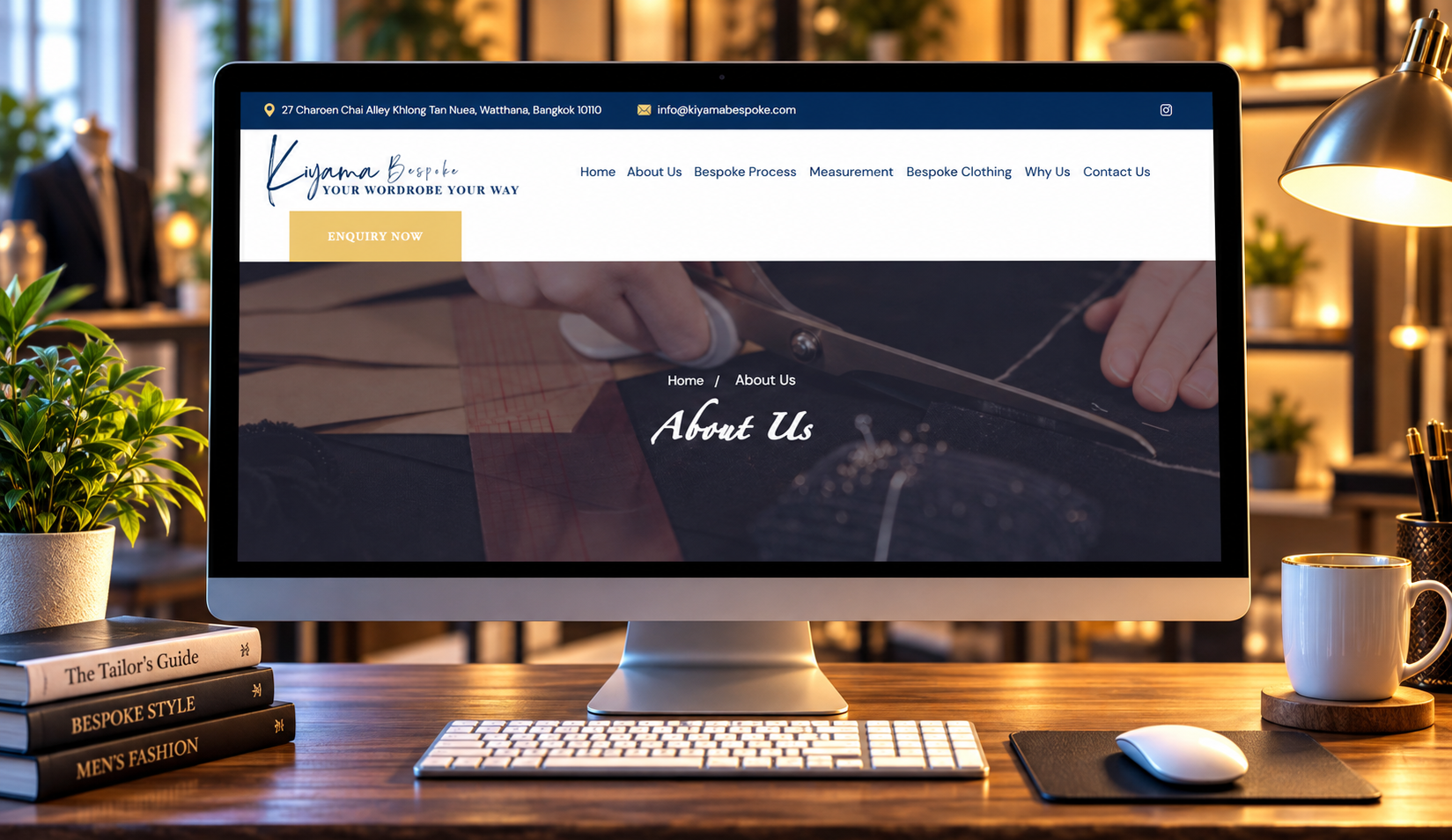

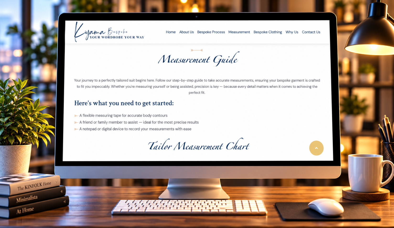
Kiyama's visual identity is built around an elegant and expressive wordmark that creates a distinctive impression. The flowing typography, refined composition, and red detailing communicate a sophisticated brand personality while keeping the name at the centre of its identity.
The digital strategy focuses on carrying this visual character into a cohesive online experience. Rather than relying on unnecessary design complexity, the proposed approach uses thoughtful spacing, consistent typography, and a balanced visual hierarchy to create a memorable brand presentation.
The website concept aims to introduce Kiyama through clear storytelling, accessible information, and an engaging interface. Each design element is intended to support the brand's identity while helping visitors explore its offerings and understand what makes it distinctive.
By bringing visual consistency and user-friendly website design together, the project establishes a direction for a recognisable digital presence that can grow alongside the brand.
The proposed discovery stage focuses on studying Kiyama's visual character, typography, and overall brand presentation to establish a consistent website design direction.
The information architecture is organised around clear brand communication, intuitive navigation, and convenient access to relevant content.
The design direction uses refined typography, balanced layouts, thoughtful spacing, and consistent brand colours to communicate Kiyama's distinctive aesthetic.
The proposed website experience brings together brand visuals, structured content, and modern interface elements to create a cohesive online presentation.
The final design considerations focus on readable content, responsive layouts, consistent styling, and straightforward navigation across devices.
Kiyama – Elegant Brand Website Design
Technology & ToolsA Refined Digital Identity Built Around Distinctive Typography and Modern Design
The Kiyama website design concept focuses on translating the brand's distinctive visual identity into an elegant, accessible, and consistent digital presentation.
The supplied Kiyama logo features expressive lettering, flowing typography, and red detailing that contribute to a refined and recognisable visual character.
Consistent branding helps maintain a recognisable identity across website sections, visual materials, and digital communication. It also creates a more cohesive experience for visitors.
Responsive design can help visitors explore brand information comfortably across smartphones, tablets, and desktop devices while maintaining visual consistency.
A professionally designed website can bring together brand visuals, organised information, and intuitive navigation to help visitors recognise and understand a brand.




Share a few details and our team will call you back within one business day with scope, timeline, and a fixed-fee estimate.