Understanding the Brand Vision
The creative approach begins with identifying the visual qualities associated with Silver Empire, including elegance, refinement, and a premium jewellery-inspired aesthetic.

Software development, digital marketing, design, and growth-focused technology services for startups, SMEs, and enterprise teams.
A distinctive luxury-inspired brand identity combining an elegant diamond emblem, refined golden detailing, and premium visual aesthetics to create a memorable impression.
The Problem
Luxury-oriented brands need a distinctive identity that communicates quality and sophistication at first glance. Generic symbols, inconsistent typography, or an unclear visual direction can make it difficult for a brand to stand out and establish a memorable presence.
For Silver Empire, the creative challenge was to develop a recognisable visual direction that reflected elegance while remaining clear, balanced, and suitable for different brand applications. The identity needed a meaningful central symbol supported by typography and colour choices that complemented its premium positioning.
Our Solution
The Silver Empire identity uses a diamond-inspired geometric emblem as its defining visual element, paired with refined lettering and a gold-toned finish.
The combination creates a sophisticated composition that communicates a jewellery-inspired aesthetic without excessive decorative complexity. A balanced relationship between the emblem and wordmark supports recognition, while the consistent colour treatment provides a cohesive visual character.
The resulting design direction offers a foundation for coordinated brand presentation across digital and physical touchpoints, helping Silver Empire maintain a distinctive and professional appearance.
Key Capabilities & Features
A geometric diamond emblem forms the centre of Silver Empire's visual identity, creating an immediate association with jewellery, brilliance, and premium aesthetics.
The gold-toned treatment gives the identity a refined appearance and helps establish a cohesive visual character across brand applications
Carefully balanced lettering complements the diamond emblem, making the Silver Empire name prominent and recognisable.
The angular gemstone-inspired mark provides a strong visual focal point that can support recognition across suitable brand touchpoints
The relationship between the emblem, brand name, and supporting text creates a structured presentation without unnecessary visual clutter.
Creating a Distinctive Identity for a Premium Jewellery Brand
A distinctive diamond-inspired symbol paired with the Silver Empire name creates a memorable visual presentation.
Elegant gold detailing and refined typography communicate a sophisticated jewellery-inspired aesthetic.
A coordinated symbol, colour treatment, and wordmark provide a foundation for consistent brand communication.
The identity offers a design direction that can be adapted to suitable digital, promotional, and packaging applications.
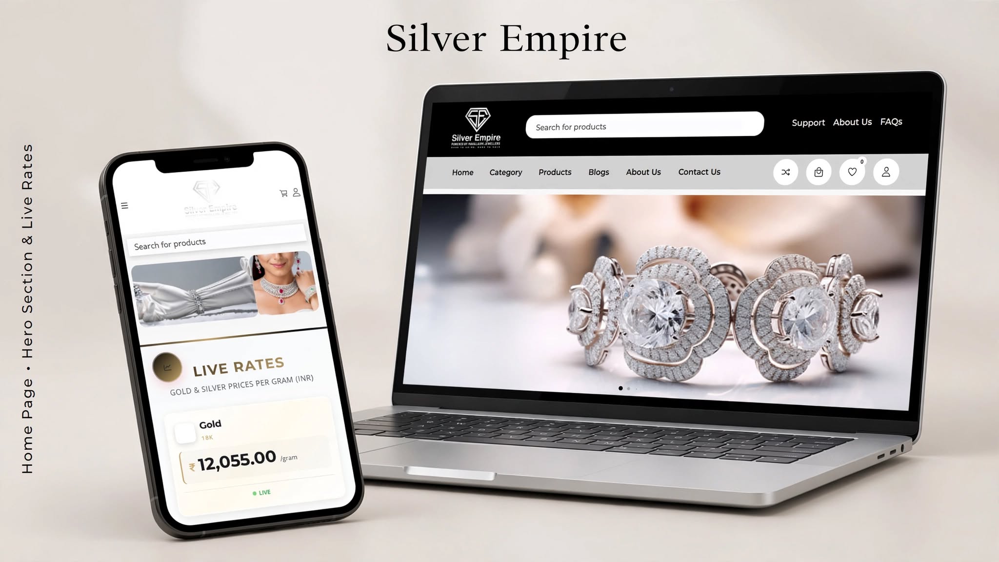
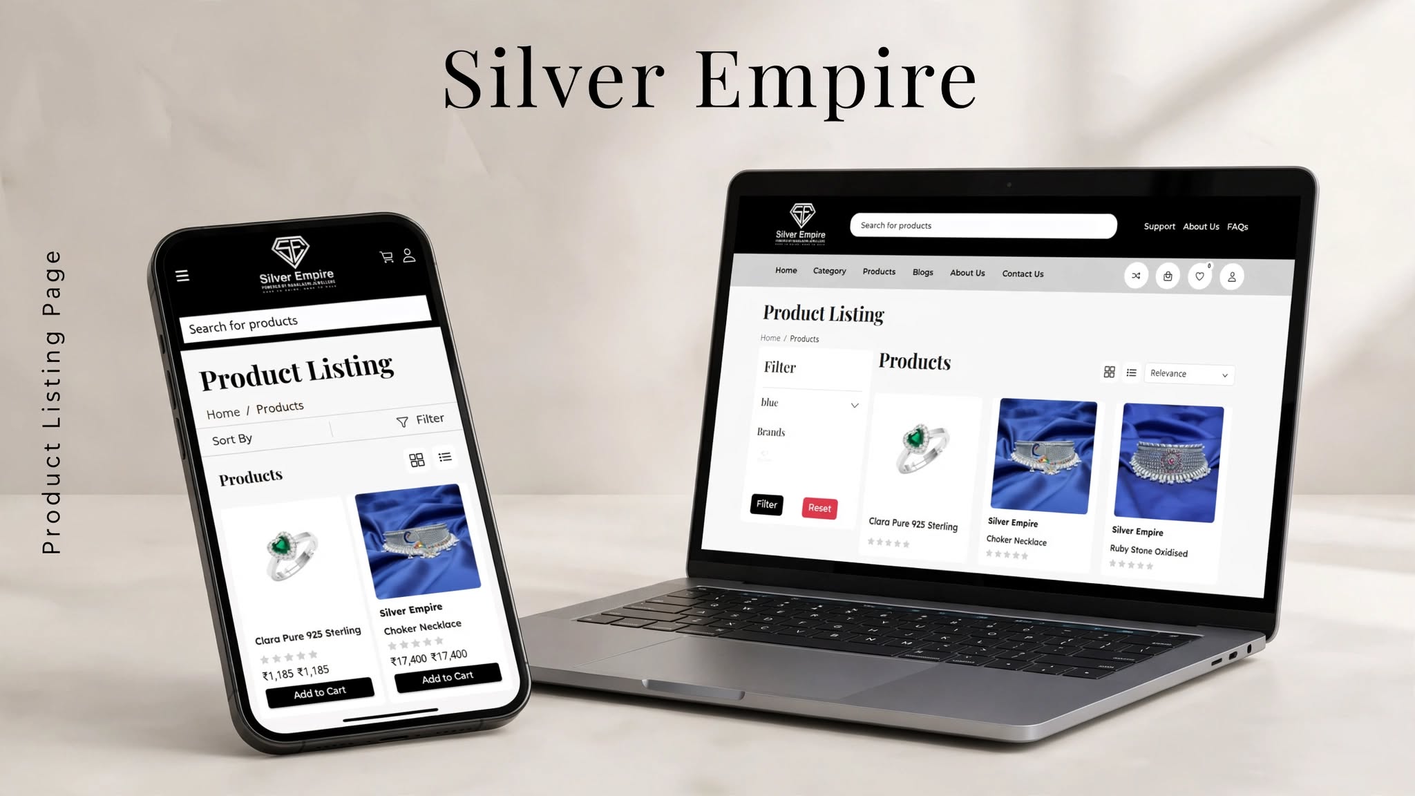
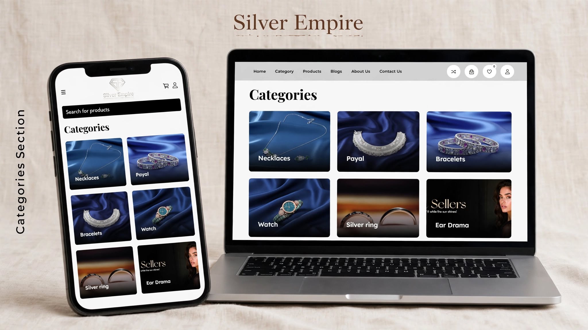
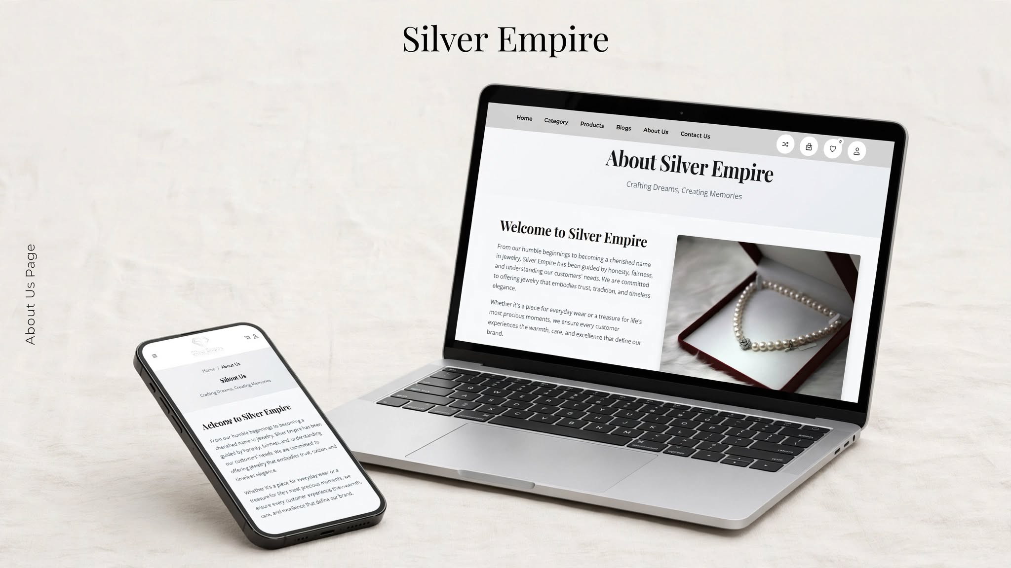
Silver Empire's visual identity centres on the idea of elegance, value, and lasting recognition. The name communicates a sense of refinement, while the diamond-inspired emblem creates a strong connection with the visual language of luxury jewellery.
The logo brings together geometric precision and sophisticated styling. Its faceted diamond symbol provides a distinctive focal point, while the gold-toned treatment adds warmth and a premium character. The typography is designed to complement the emblem without competing with its visual impact.
The brand strategy focuses on creating an identity that is memorable, adaptable, and consistent. A recognisable symbol can help establish continuity across packaging, promotional materials, social media graphics, and other customer-facing touchpoints.
By combining a meaningful visual symbol with balanced typography and refined colour choices, Silver Empire's identity offers a cohesive foundation for presenting the brand with confidence and elegance.
The creative approach begins with identifying the visual qualities associated with Silver Empire, including elegance, refinement, and a premium jewellery-inspired aesthetic.
A diamond-inspired geometric direction is used to establish a meaningful visual connection with brilliance, value, and recognisable luxury styling.
Gold-toned detailing and carefully balanced typography complement the central emblem, giving the identity a cohesive and sophisticated appearance.
The emblem, brand name, and supporting text are arranged into a unified design that balances visual impact with clarity.
The identity is considered in the context of potential digital, promotional, and packaging uses to support a consistent brand presentation
Silver Empire – A Distinctive Jewellery Brand Identity
Technology & ToolsAn Elegant Visual Experience Inspired by Brilliance, Craftsmanship, and Timeless Luxury
The Silver Empire logo features a diamond-inspired geometric emblem that visually communicates elegance, brilliance, and a premium jewellery-inspired identity.
A diamond is widely associated with precious jewellery, refinement, and lasting value. Its geometric form also creates a distinctive and memorable visual symbol.
The identity combines a faceted gemstone-inspired emblem, elegant gold-toned styling, and prominent typography to create a cohesive visual presentation.
Gold-toned detailing adds warmth and sophistication, supporting the brand's luxury-inspired visual character.
A professionally designed logo helps jewellery brands establish a recognisable identity, communicate their aesthetic, and maintain visual consistency across customer-facing materials.




Share a few details and our team will call you back within one business day with scope, timeline, and a fixed-fee estimate.